
ALOHA,
Thank you for following my journey in Adobe Illustrator logo design. Below I will explore the process of drafting and completing the final design.
Design Process
- Completed Adobe Illustrator Tutorials
- Brainstorming
- Research
- Sketches
- Draft
- Feedback Review
- Self-Critique
- Made changes to the original design: font and drop shadows.
- Executed final design.
- Saved as a “.ai” and exported “web legacy” for blog post.
- Revised blog post layout
This design process included the completion of our assigned Adobe Illustrator tutorials, brainstorming ideas that I wanted the logo to embody, research from our required readings, bringing to life the ideas swirling in my head by sketching them on a notepad, and the completion of my draft logo. Additionally, I reviewed my classmate’s posts for inspiration and reviewed the feedback they left me on my blog.
After completing the required readings and our illustrator tutorials, I proceeded to reflect on ideas about how I wanted the logo to represent myself and my website, paradicing.com. I wanted my logo to be colorful, tropical, and fun. So, I then took to my notepad, and after a few sketches, it was clear to me that I wanted a circular logo that was inclusive of tropical visions and colors.
From the illustrator tutorials, I utilized lessons in the following illustrator tools: shape building, layering, object grouping, object alignment, fill, stroke, opacity, alignment, transform-reflect, etc.
Adobe Illustrator Tutorial Links
Logo Significance and Elements
- Colors
I wanted to include colors that represented where I am from. The variety of colors represents the rainbow state, Hawai‘i, my home.
- Key Element: Monstera Leaf
“… In Hawai‘i, it is said that monstera leads to ray of hope because of South island sunshine. So if you arrange monstera in the room, you might get good luck.” (Spiritualism, 2015) Growing up, I always related to the monstera plant, in particular the leaf. I wanted to include this in my logo as it represents a ray of hope. Also, as you move the plant around (or as we travel in relation to my website), you may be brought luck or new ventures. I thought this leaf represented paradise, new ventures, and wellness, all of which align with paradicing.com’s ideals. - Shape
I wanted the entirety of the logo to be in a circular shape to represent the full circle of travel, food, and wellness. Additionally, I wanted the circular shape to be a representation of a Hawaiian lei, to both embrace and welcome my viewers to the website.
- Font
I decided to go down the route of a 70’s style Hawai‘i logo. With all of the pop of colors it is reminiscent of the 70’s so I wanted to include a font that added to that feel of old Hawai’i and an always-welcoming-home. According to our reading, when choosing your font, you want to “…make sure your choice ties in psychologically with your client’s goals.” (Craig, 2023). Old Hawai’i, or getting back to the basics, is something that aligns with my website’s attracted guests and the website’s ideals: connecting with people, food, and well-being. This reflection of connection between my website’s message and viewers contributed to my decision to make a logo with a 70’s vibe.
After reviewing my feedback from my classmates and some self-reflection, I decided to go on search on a font that best fit my needs and ideas rather than stick with the font family preloaded onto Adobe Illustrator. Through the Adobe website, I was able to find Adobe Fonts. Adobe Fonts has cleared and allowed individuals to use these fonts for both personal and commercial use. Once I found the font family that best fit my needs and wants for my logo, I then applied it to my design. The font family I chose to implement in my design is called “Memoriam Pro” and you can access this font by clicking HERE
Technical Execution
This took me hours. For one, I was nervous even to begin because I struggled with our illustrator tutorials, and this was something that took me out of my element. Once I conquered my fears, I began to sketch a few simple ideas on a note pad, some of which I have included in this blog post below.

I went in with the plan to have the monstera leaf and the website title, something simple and not overwhelming. However, I started to have a lot of fun and made multiple changes to the logo, over and over again.
I hand sketched a monstera leaf on illustrator, using the pencil tool and with my computer pen. Honestly, it was not the prettiest, but illustrator allowed me to edit the shape and smooth out my lines. After I created a monstera leaf outline that I liked, I made multiple copies of the leaf, started playing around with the tools provided in Illustrator, and referred back to what I had learned in our tutorials and readings and applied it to the images.
I later realized that, in using the combination of the pen tool, anchor point tool, and selection tool, I was able to create a slice between the original monstera that I had drawn, and it created a more realistic feel to the monstera.
I created a monstera leaf I was happy with and deleted the ones I did not like. I multiplied the leaves and added a different size, color fill, and used the object-> reflect tool to give them a different feel and organized them together around the circle I created as a guide in the background.
I placed the monstera leaves as a lei around the circle and added my website title “paradicing.” I used a stroke of 3 px for the font and changed the individual color to blend with the arrangement of colors in the entire logo.
I decided on circle seemed to drain the color of the logo. I then multiplied the original circle and used the dropper tool to implement colors from the logo in the background circle and scatter layered each of them to give a telescope feel, additionally attributing to the 70’s feel of the logo.
Self Critique
Initially, I hadn’t received any feedback from my classmates. However, in viewing my groupmates final products I was inspired. I saw amazing effort from my classmates in their utilization of graphic balance and use of gradient within their images. I realized I may want to create a more balanced image. Possibly moving the text outside of the circle or minimizing the “P” in my image. While there seems to be movement amongst the monstera and circular design the font seems free standing contrasting with an overall visual balance.
While I want to keep the vibrant colors in the image, I could possibly tone down the font in color. I have more ideas I would like to play with in cutting out a portion of the circular object and balancing outside text, as inspired by my classmate, Katie.
As for my blog post layout. I am still struggling with having a “featured image,” so that my home page includes a sneak peek into my blogs without a huge duplicate of the image appearing in my blog post. For visual purposes of the blog, I removed the featured image so that the post itself is a clean, clear, and engaging read for my viewers.
Overall, I enjoyed this process, and I was excited to find that my classmate’s feedback greatly reflected my own concerns. This made it easy for me to concentrate on the key changes I needed to make, font, balance, and depth.
Please continue reading below to see the changes made to the overall design.
LETS MAKE SOME CHANGES

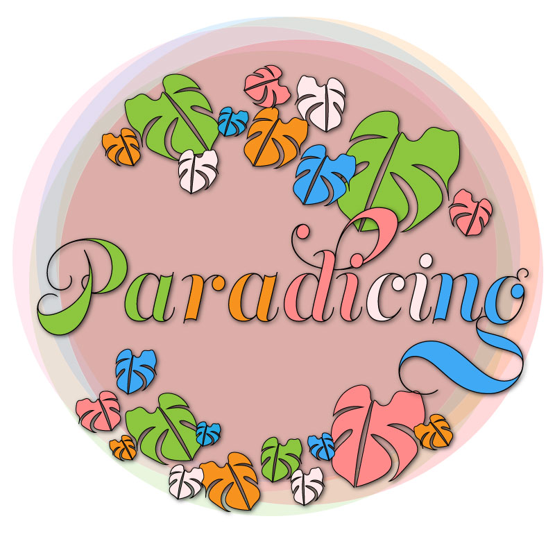
Key changes I made to the original design included font change and image enhancement to the monstera leaves.
Font changes:
Font family
Color choices
Drop down shadow
Sizing/Spacing
Image enhancement:
Repositioning
Color changes
Drop shadow
Font Changes
First, I completly deleted my original font design. Started fresh, and again, I changed the font family to Memoriam Pro. I then changed the overall size to 125 px and changed the width of the stroke to 1.5px and rearranged the color scheme evenly between letters. I adjusted the spacing between the letters to my liking by pressing “alt+ left or right arrows” on my keyboard. (Another technique we I utilized from our adobe illustrator tutorials)
Finally, to provide more depth and focus to the brand name I added a drop shadow with the following values pictured below:
(select font, select effect, stylize, dropshadow)
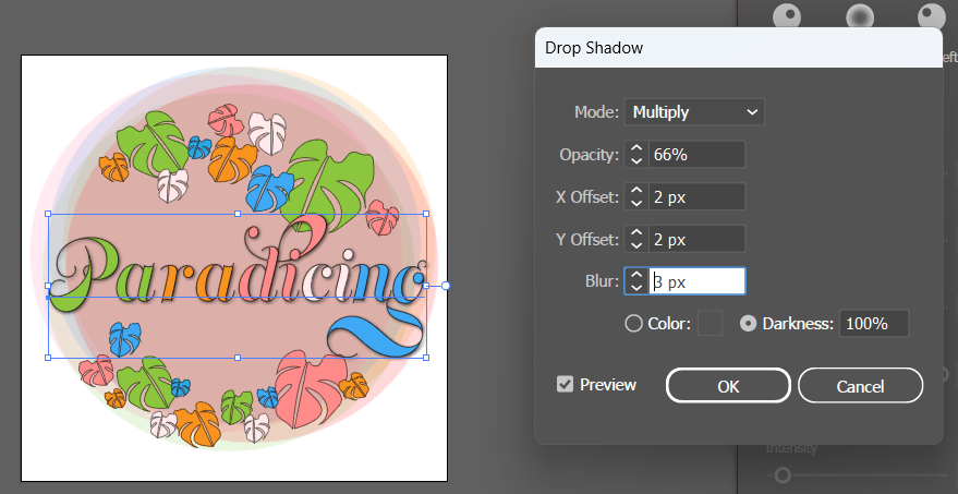
Image Enhancements
While I made changes to the font and positioning of the brand name, I realized I lost balance. To recreate an image that was balanced I decided to remove a leaf from below the large “g” and reposition it towards the “p” to provide more balance. I changed it further by switching the direction of the leaf by selecting the leaf and clicking: “object+transform+reflect”. Zooming out by selecting “crtl+0”, I noticed that the color balance was now off. To even the color balance out I changed the original orange color to a blue. Finally, to create more depth to the leaves I selected the group I created, selected “effect+stylize+dropshadow”. As I had previously saved the values for my font it was able to apply the same values to the leaves to create unity between the font and the leaves.
Blog Post Layout
I tried to give the overall look of the blog a refresh. I wanted to incorporate colors associated with my logo design. Additionally, I removed the list paragraphing from some of my blocks to provide a less mechanical and more enjoyable read. Finally, I adjusted font sizes and incorporated more images into the blog to create visual breaks between the writing.
References
Spiritualism. (2015, September 17). 7reasons Monstera Floriography has good effect on home. Spiritualism. Retrieved February 17, 2023, from https://en.spiritualism-japan.com/home-monstera-floriography/#:~:text=The%20image%20of%20the%20floral%20language%20comes
%20from,in%20the%20room%2C%20you%20might%20get%20good%20luck.
William Craig ~ 10 minutes to readPresident of WebFX. Bill has over 25 years of experience in the Internet marketing industry specializing in SEO. (n.d.). 5 branding basics every logo designer should know. WebFX. Retrieved February 17, 2023, from https://www.webfx.com/blog/web-design/5-branding-basics-every-logo-designer-should-know/
Illustrator tutorial: Fist Logo. Professional Multimedia Content Creation. (2015, June 2). Retrieved February 17, 2023, from https://com561.wordpress.com/illustrator-tutorials/fist-logo-illustrator-tutorial/
Illustrator tutorial: Pencil illustration. Professional Multimedia Content Creation. (2016, May 28). Retrieved February 17, 2023, from https://com561.wordpress.com/illustrator-tutorials/pencil-illustration-illustrator-tutorial/
Illustrator tutorial: Banner design. Professional Multimedia Content Creation. (2021, September 18). Retrieved February 17, 2023, from https://com561.wordpress.com/illustrator-tutorials/illustrator-tutorial-banner-design/
Illustrator tutorial: Varsity lettering. Professional Multimedia Content Creation. (2017, May 25). Retrieved February 17, 2023, from https://com561.wordpress.com/varsity-lettering-illustrator-tutorial/
Illustrator tutorial: To-do list app icon. Professional Multimedia Content Creation. (2015, May 29). Retrieved February 17, 2023, from https://com561.wordpress.com/illustrator-tutorials/to-do-list-app-icon-illustrator-tutorial/

Leave a comment