Design Process
This design process included research from our required readings, multiple tries at our Illustrator tutorials in class, sketching, and a lot of patience. After completing the required readings and our illustrator tutorials, I proceeded to reflect on ideas about how I wanted the logo to represent myself and my website, paradicing.com. I wanted my logo to be colorful, tropical, and fun. So, I then took to my notepad, and after a few sketches, it was clear to me that I wanted a circular logo that was inclusive of tropical visions and colors.
From the illustrator tutorials, I utilized lessons in the following illustrator tools: shape building, layering, object grouping, object alignment, fill, stroke, opacity, alignment, transform-reflect, etc.
Please see links to these illustrator tutorials below:
Logo Significance and Elements
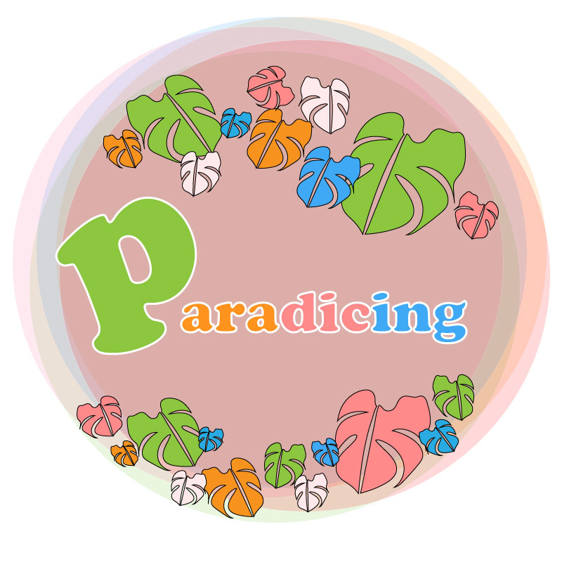
- Colors
- I wanted to include colors that represented where I am from. The variety of colors represents the rainbow state, Hawai‘i, my home.
- Key Element: Monstera Leaf
- “… In Hawai‘i, it is said that monstera leads to ray of hope because of South island sunshine. So if you arrange monstera in the room, you might get good luck.” (Spiritualism, 2015) Growing up, I always related to the monstera plant, in particular the leaf. I wanted to include this in my logo as it represents a ray of hope. Also, as you move the plant around (or as we travel in relation to my website), you may be brought luck or new ventures. I thought this leaf represented paradise, new ventures, and wellness, all of which align with paradicing.com’s ideals.
- “… In Hawai‘i, it is said that monstera leads to ray of hope because of South island sunshine. So if you arrange monstera in the room, you might get good luck.” (Spiritualism, 2015) Growing up, I always related to the monstera plant, in particular the leaf. I wanted to include this in my logo as it represents a ray of hope. Also, as you move the plant around (or as we travel in relation to my website), you may be brought luck or new ventures. I thought this leaf represented paradise, new ventures, and wellness, all of which align with paradicing.com’s ideals.
- Shape
- I wanted the entirety of the logo to be in a circular shape to represent the full circle of travel, food, and wellness. Additionally, I wanted the circular shape to be a representation of a Hawaiian lei, to both embrace and welcome my viewers to the website.
- Font
- I decided to go down the route of a 70’s style Hawai‘i logo. With all of the pop of colors it is reminiscent of the 70’s so I wanted to include a font that added to that feel of old Hawai’i and an always-welcoming-home. According to our reading, when choosing your font, you want to “…make sure your choice ties in psychologically with your client’s goals.” (Craig, 2023). Old Hawai’i, or getting back to the basics, is something that aligns with my website’s attracted guests and the website’s ideals: connecting with people, food, and well-being. This reflection of connection between my website’s message and viewers contributed to my decision to make a logo with a 70’s vibe.
Technical Execution
This took me hours. For one, I was nervous even to begin because I struggled with our illustrator tutorials, and this was something that took me out of my element. Once I conquered my fears, I began to sketch a few simple ideas on a note pad, some of which I have included in this blog post below.
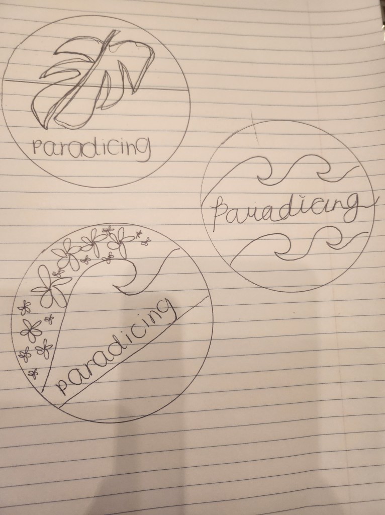
I went in with the plan to have the monstera leaf and the website title, something simple and not overwhelming. However, I started to have a lot of fun and made multiple changes to the logo, over and over again.
I hand sketched a monstera leaf on illustrator, using the pencil tool and with my computer pen. Honestly, it was not the prettiest, but illustrator allowed me to edit the shape and smooth out my lines. After I created a monstera leaf outline that I liked, I made multiple copies of the leaf, started playing around with the tools provided in Illustrator, and referred back to what I had learned in our tutorials and readings and applied it to the images.
I later realized that, in using the combination of the pen tool, anchor point tool, and selection tool, I was able to create a slice between the original monstera that I had drawn, and it created a more realistic feel to the monstera.
I created a monstera leaf I was happy with and deleted the ones I did not like. I multiplied the leaves and added a different size, color fill, and used the object-> reflect tool to give them a different feel and organized them together around the circle I created as a guide in the background.
I placed the monstera leaves as a lei around the circle and added my website title “paradicing.” I used a stroke of 3 px for the font and changed the individual color to blend with the arrangement of colors in the entire logo.
I decided on circle seemed to drain the color of the logo. So I multiplied the original circle and used the dropper tool to implement colors from the logo in the background circle and scatter layered each of them to give a telescope feel, additionally attributing to the 70’s feel of the logo.
References
Spiritualism. (2015, September 17). 7reasons Monstera Floriography has good effect on home. Spiritualism. Retrieved February 17, 2023, from https://en.spiritualism-japan.com/home-monstera-floriography/#:~:text=The%20image%20of%20the%20floral%20language%20comes%20from,in%20the%20room%2C%20you%20might%20get%20good%20luck.
William Craig ~ 10 minutes to readPresident of WebFX. Bill has over 25 years of experience in the Internet marketing industry specializing in SEO. (n.d.). 5 branding basics every logo designer should know. WebFX. Retrieved February 17, 2023, from https://www.webfx.com/blog/web-design/5-branding-basics-every-logo-designer-should-know/
Illustrator tutorial: Fist Logo. Professional Multimedia Content Creation. (2015, June 2). Retrieved February 17, 2023, from https://com561.wordpress.com/illustrator-tutorials/fist-logo-illustrator-tutorial/
Illustrator tutorial: Pencil illustration. Professional Multimedia Content Creation. (2016, May 28). Retrieved February 17, 2023, from https://com561.wordpress.com/illustrator-tutorials/pencil-illustration-illustrator-tutorial/
Illustrator tutorial: Banner design. Professional Multimedia Content Creation. (2021, September 18). Retrieved February 17, 2023, from https://com561.wordpress.com/illustrator-tutorials/illustrator-tutorial-banner-design/
Illustrator tutorial: Varsity lettering. Professional Multimedia Content Creation. (2017, May 25). Retrieved February 17, 2023, from https://com561.wordpress.com/varsity-lettering-illustrator-tutorial/
Illustrator tutorial: To-do list app icon. Professional Multimedia Content Creation. (2015, May 29). Retrieved February 17, 2023, from https://com561.wordpress.com/illustrator-tutorials/to-do-list-app-icon-illustrator-tutorial/

Leave a reply to ashleyabordonado Cancel reply